
Claude Monet is one of the most prestigious – and prolific – artists of all time. With a career that spanned more than six decades, he’s become one of the icons of art history. He’s right up there with Da Vinci, Renoir, and Picasso. Monet is famous for pioneering his own Monet style artwork. This style is now known as impressionism.
To understand how to make the most of Monet home decor, we first need to understand impressionism. Let’s take a closer look!
What is Impressionism? (Monet Style)
For centuries before Monet, Renaissance art dominated the European style. With its realism, the Renaissance style was a revolution in art in and of itself.
Before the Renaissance, medieval art was far from realistic. There was no sense of perspective and human figures were heavily stylized.
Renaissance art, on the other hand, was steeped in perspective. An excellent example is Da Vinci’s iconic painting The Last Supper. In this painting, all the lines of the room converge on a single point.
It was also obsessed with realistically portraying the human form. For instance, 18th-century artist Joseph Ducreux was famous for painting people in a variety of positions.
The Monet style was a huge break with that tradition. Indeed, Monet started an entirely new trend: impressionism.
Instead of portraying its subjects realistically, impressionism creates an “impression” of the subject. It uses broad strokes and bright colors to create a blurred image that’s still recognizable.
Impressionism quickly came into vogue. Other artists like Manet, Degas, and Cezanne are other famous artists in this genre.
So, how can you build a room around Monet home decor? Let’s look at five of his most famous paintings, and see how you can incorporate them into a room.
Path Through the Corn at Pourville
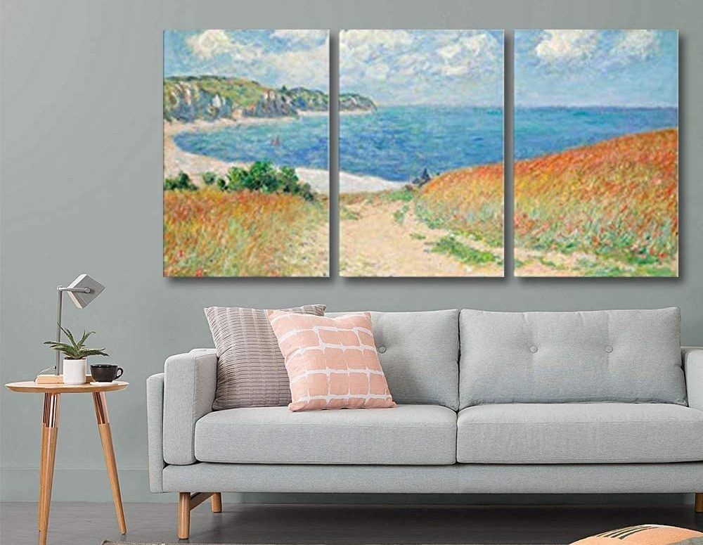
Monet painted Path Through the Corn at Pourville in 1882, smack in the middle of his prolific career. It depicts a field of corn, separated by a curved, beige-colored path that leads down to a beach. The blues and whites of the sky form a sharp contrast to the orange and gold of the cornfield.
This painting exemplifies a classic Monet style of pairing complementary colors. Orange and blue are on opposite sides of the color wheel, which makes for a beautiful pairing.
Take advantage of this for decorating your room. With a blue-gray wall and furniture, you can match the sky in the painting. Add an orange lamp or some orange throw pillows, and you’ll match the painting perfectly, without overwhelming your guests with orange.
Water Lilies
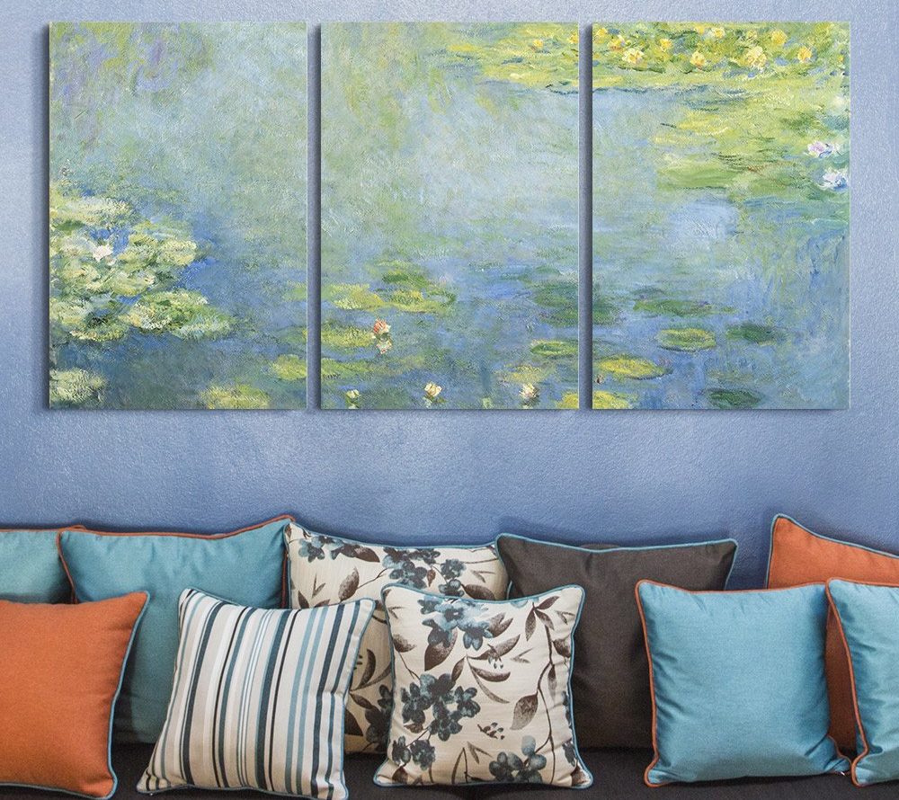
Towards the end of his career, Monet painted several series of paintings around common themes. The most famous of these series is his Water Lilies series, which consists of almost 250 paintings.
Path Through the Corn at Pourville relies on contrast between two halves of the painting. On the other hand, the Water Lilies series is mostly monochromatic. The paintings are rich in blues and greens, with occasional splashes of color from the flowers.
To build your Monet home decor around the Water Lilies paintings, don’t hesitate to be bold. You can use some blues and greens to match the paintings, but go ahead and throw in some color.
Floral themes are particularly good for providing an attractive accent. On the other hand, neutral tones can keep your room from becoming too garish.
Argenteuil
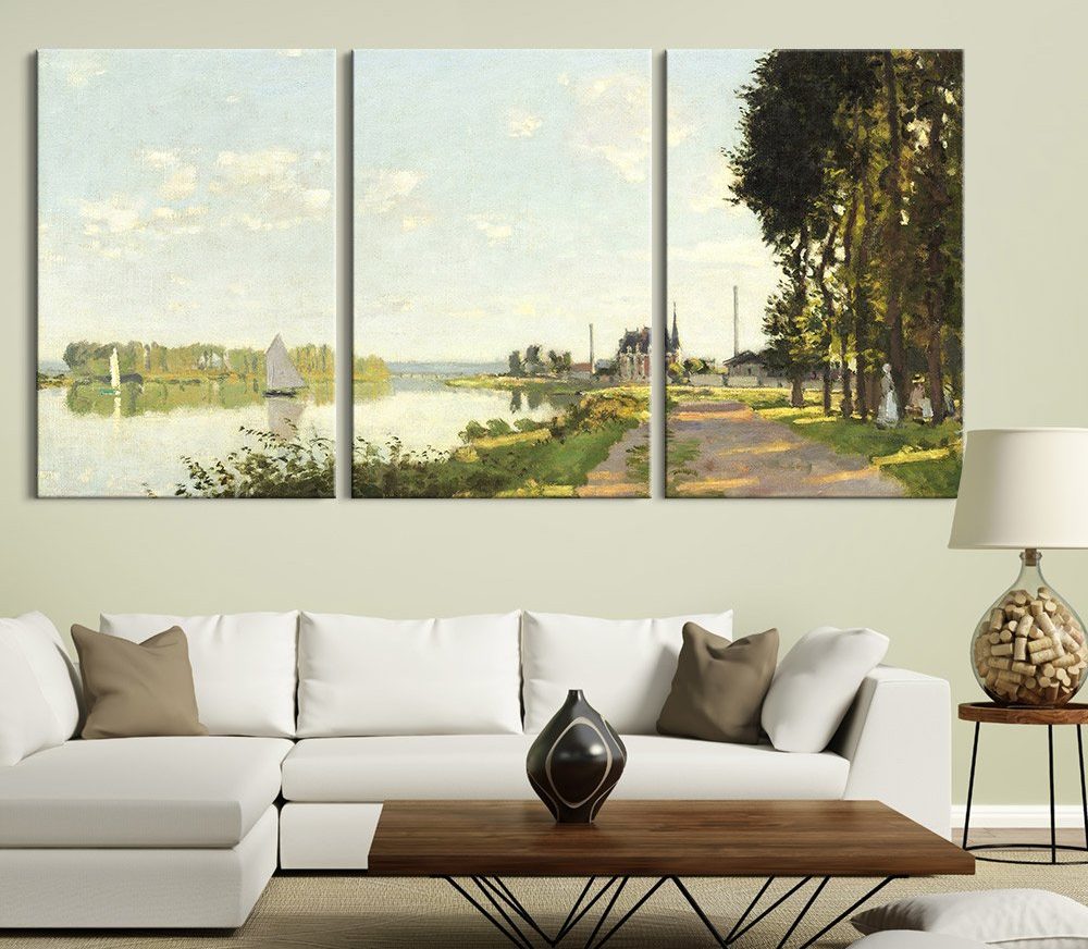
In the 1870s, Monet moved his family to the town of Argenteuil, a suburb of Paris. The town is known for its wide river basin, which was full of small skiffs and fishing boats. The result was a series of paintings that are rich in blue and green, with colored boats and buildings for contrast.
Because these paintings are brightly lit, a Monet style Argenteuil decor scheme will work best in a well-lighted room. Look for neutral tones, preferably in a cream or blue-white color space. This will provide a pleasant match for your painting.
Brown colors are also helpful here, since they melt right into the painting. Any bright colors should be kept to a minimum. We’re talking about throw pillows and nicknacks only.
Regatta at Sainte Adresse
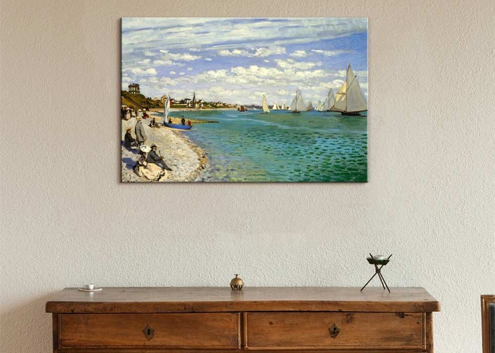
Monet painted Regatta at Sainte Adresse relatively early in his career, while he was visiting his father. The painting depicts a group of people on a beach, watching a boat race. The water is blue-green, typical of Monet, while the cream-colored beach, clouds and boat sails provide a pleasant contrast.
To complement this painting, take advantage of the cream tones and accent them. An off white wall can help with this, as can off white furniture.
If you want more color richness, consider warm brown hardwood. This will brighten up the cream in the painting.
Accent colors should be kept to a minimum. This color scheme is all about neutral tones and a laid-back look.
As a result, the Regatta look is ideal for hallways. These rooms should stand on their own without attracting attention. Very different from if you were using Klimt Style.
Meadow With Poplars – The Most Famous Work In Monet Style
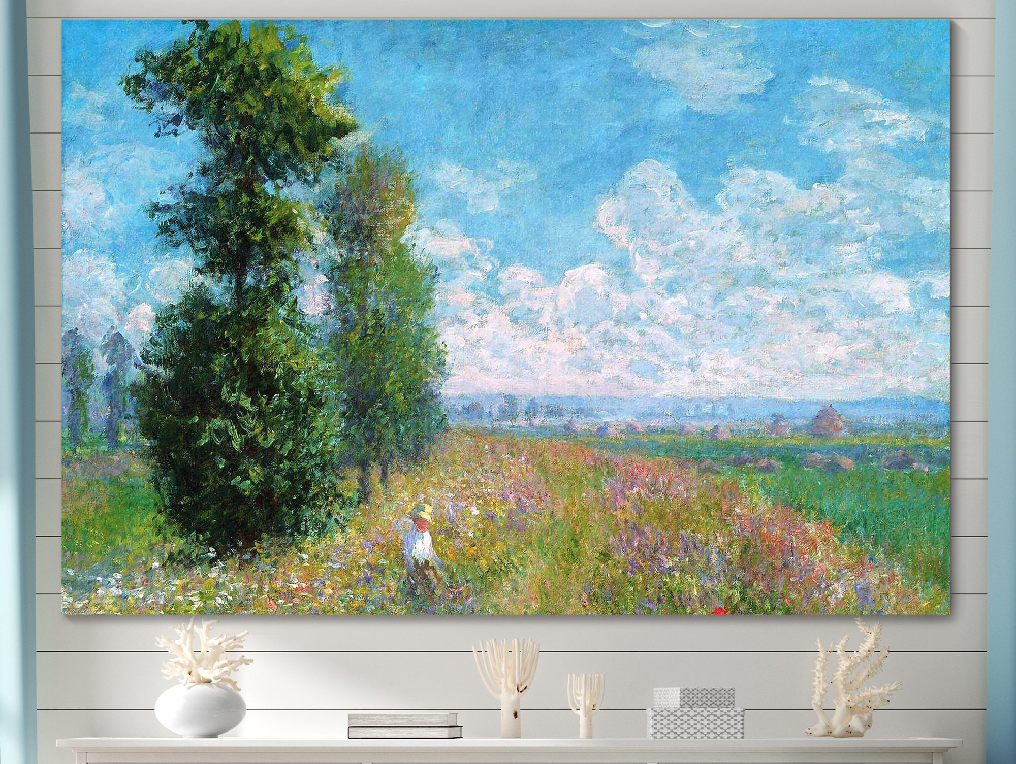
Meadow With Poplars hearkens back to a higher-contrast appearance. It depicts a young woman in white, walking through a colorful field of flowers. Overhead, purple and grey clouds billow through a rich blue sky.
The advantage of this painting is that it’s so rich in color. In a sense, you can really do anything with it.
That said, the warm, summery appearance is ideal for a sunroom or another room with a lot of white and blue. The green trees in the painting are very bold, and seem to pop out of the canvas. If you’re feeling similarly bold, add a deep green throw pillow or knickknack.
Everything else should live in that happy, white and blue space.
Conclusion
As you can see, creating a Monet style room decor scheme is very easy. Simply look at the color scheme and the theme of the painting, and build your room to match. Follow these simple tips, and your friends will be gushing over your home’s new makeover!